Thursday, December 8, 2011

Visual Techniques

Predictability


Spontaneity


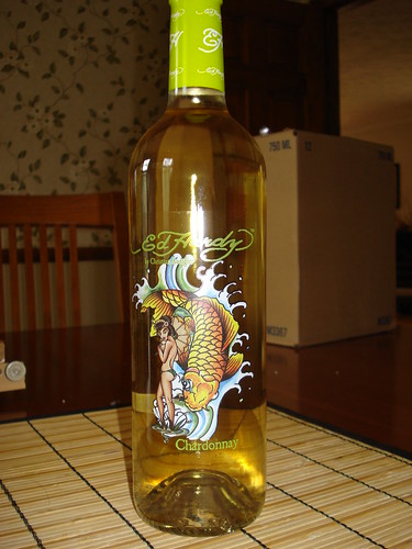
Any one that knows the designer Ed Hardy already knows that he does tattoo designs and tacky advertisement. He now has a chardonnay line which i find awful and horrendous, but he probably makes money off it. Anyways the design of his label is so predictive because all of his clothing line and "recognizable" label and face type have the same theme. Anyone could have guessed that he would do some sort of "tattoo" design to label his wine line. On the other hand a company called Luck Duck has such a cleaver design that it is so spontaneous that no one would have ever though of their label. The creativity and design of the label is so visually stimulating as well as enjoyable to look at. "Lucky" is represented by a wishbone and the duck of course is represented by a duck with quirky accessories to fit the mood of the particular wines that they have. Its such a clever idea and such a simple design.

Thursday, December 1, 2011

Contrast


In this minimal movie poster for the film "Tron," the artist use such great contrast with the color scheme. Any one that has see the cartoon, commercial, or even the movie would know that blue and yellow were the main colors in the film. Also with the great negative space in the back it still gives a sense of direction with the track that the lines have left. It represents a small amount of the movie where the motorcycles race. I like how he was able to keep the entire poster to a irreducible minimum and yet still get across the idea he wanted to express.


This movie poster is so bad there aren't enough words to describe it. First off as a vis comm major the typeface that is used in this poster has no substance at all and there is not character to any aspect of it. Second of all the placement of the characters in the movie are poorly situated. The contrast between the type face and the different objects in the poster do not mesh well together. As an audience i dont think this poster makes the movie anymore interesting and make the person want to watch it.

Thursday, November 17, 2011

Movement/Motion

There are so many ways of creating an amazing photo with a unique twist on movement and motion. In the first photo there are 2 dice that appear to be rolling in motion followed by a movement of air. This shows the way the dice are moving in some what of a slow motion movement. The eye cant help but finish the roll in the mind. It creates an illusion that the dice are actually moving in a certain direction.

In this second image movement plays a huge factor. We all know what the flow of water looks like and the way a water balloon explodes. In this slow still frame, the photographer captures water flowing on the top of a persons head in extreme slow motion. This allows the viewer to see the water in its natural state and the motion it creates once it hits the persons head.

Thursday, November 10, 2011

Depth/Space/Scale


This "Cars" movie poster caught my attention because it has so much depth to it. The way each object in the poster is positioned gives the look some scale. With the Main character in the front center and all the supporting characters behind it gives a sense of Relative Sizing visually making the main character bigger than he is. Also with Linear Perspective, the audience in the background look very tiny because of the distance from the racing track to the so called bleachers. I also believe that color plays a big part in creating the illusion of depth. The more vivid deeper colors are mainly in the front and as you move your eyes to the back of the poster it gets to be a little bit darker making things seem further than they are.

Thursday, November 3, 2011

Tone and Color


This is one of my all time favorite videos but OK GO. The reason why i chose this video is because they were so creative in the way they used color and the way they made this video. The Machine they used was created by Rube Goldberg. At the 1:54 mark you can clearly see tone being used throughout the flags and they flow in a certain direction. Each flag was a color or tone of the rainbow and as in flowed it quickly went through all the tones of each color. It was obvious that tone worked with direction as the video was all about direction in order for it all to work together. Color on the other had was throughout the entire video whether it be a small amount or a lot. You cannot help but notice all the colors that were in each continuous frame. The whole point of this video was movement and color definitely worked well with it. This video was one continuous shot and in the grand finale at the end they all got sprayed with paint. I thought this video was such a great concept and im sure it took a lot of work to get the final results. It was such a great way to use tone, direction, color, and movement.

Thursday, October 27, 2011

The Basic Elements


Jackson Pollock is known for his amazing paintings. His astonishing artwork emulates movement and such depth in texture. As one looks at his work they find themselves somewhat memorized by the business and feeling they get from viewing such great art. They eyes want to constantly scan the painting from one end to the other and all other directions. As well as feel the need to touch the painting because of the texture it shows.


This image focuses on Dondis' basic element of Movement and Shape. As a vis comm major this stood out to me because of the natural flow of the pouring milk into the letters. As the milk flows into the shapes of the letters it visually appears that the milk is poured as if it were a glass cup. The motion of the image and the continuity makes me want to visually finish what the letters appear to be filled by the milk.


I am such a huge fan of Andy Warhol. His use of color and creative flow is so inspiring. His iconic pop art has such great use of complimenting colors that make the end product work together. Warhol uses the three dimensions hue, saturation, and brightness in his work. I think the way he uses these dimensions depicts the outcome of what the art turns out to be. Most of Warhol's work has beautiful vibrant colors and such great use of textures and patterns.

Thursday, October 13, 2011

Visual Perception


This past summer i went to Coachella Music and Art Festival in Indio, CA. As a vis comm major i was amazed and in awe at all of the intriguing designs of the booklets, posters, and sculptures. The poster for this concert is such a powerful yet simple design. The main headliners of this concert are in bigger bolder letters which captures the readers attention. All the other bands that are playing throughout the day and are much more "underground" bands get smaller as the list continues. What i like most about this poster is the font and placement of words. The placement of this poster allows the user to scan their eyes through the entire poster, especially to look for their favorite bands. Its interesting to see how much a font can express. This poster somehow denotes the theme for Coachella and what it is all about.

Thursday, October 6, 2011

Top Down Process


As a Visual Communications major i am constantly thinking of cleaver ad ideas like this Audi vs BMW car ad. These billboards were strategically put so that the audience can see the response ad of BMW to Audi. With the ad of Audi, the viewer must read all that is on the poster in order to get what is on BMW's ad is about. This allows the car companies to not only humor the viewer but let them see what they have to offer. The eyes saccades to scan paths between the two ads and they fixate on the details of both audi and BMW and make the connection. Thus after making the connection the eyes tend to go back and forth for a second look and get the meaning of the two billboards.

Thursday, September 29, 2011

Week 5 Success and Failure


This Ad by Apple has very little detail yet it gets it message across to the audience. I feel this denotes everything about music and what it is. With the silhouette of the girl dancing and hair tossed everywhere, it represents life, fun, and energy. I would like to get into producing creative ads like this.


On the other hand this movie poster for the movie 2012 is quite horrible and boring. I have not seen the movie, but this poster makes me not want to watch it. There is no substance in this poster and it does not show any feeling or help the audience understand what the movie is about.

Thursday, September 22, 2011

Unemployment.


Lost, What do i do now?, Why, How, Whats next?

From the visual perspective of this photo, this man looks like he has lost everything. You can tell by the body language with his hands on his head and sitting down on the steps of a huge company, or his job, that he has no idea how he got to this point. With the lens of this photo being focused on the man and the background of the steps blurred out, anyone that looks at this photo can see that he is the main idea of this picture. The man looks tired and puzzled at why his job has let him go and he does not know where to go from here.

Thursday, September 15, 2011

Meaning 2


As a Visual Communications major i chose this photo to represent the work i want to get into. These series of Coke ads are representational, abstract, and symbolic to the brand. Viewing this image from the representational aspect, these pictures depict what the brand is all about. Their slogan is "Live on the Coke side of life." This allows the user to create a mental image of what they believe Coke is. As for the abstract point of view this shows how each picture and each story lives on the coke side of life. With the images depicting the flow of objects going into the bottle, it shows how happiness can come from within. The symbolism for this piece is easily noted. The curves of the bottle denote all the way back to the first coke presentation and packaging. Even at its irreducible minimum we as the user can still identify what the product is. This allows the viewer to remember what coke stands for and that they have been around for years and have not forgotten their roots.

Thursday, September 8, 2011

Meaning 1


This image represents the phone of all phones. When we see this image we automatically know what it is. The form and shape that it embodies tells us that it is a certain type of phone. The cord, dial, phone piece, and cradle gives us the definition of what it is.


With this abstract photo one can tell that it is simply a key. Although this key does not resemble our car key or door key, it is still identifiable. In the photo the key has been stripped of its detailed design yet with the shadow of the end and tip it still depicts what we know as a key. Even though this key is a much dated key than what they look like today, the tip with the ridges allows us to mentally believe that this is in fact the object we believe it to be. With the most identifiable characteristics of the phone, no mater what shape or form it evolves to, as long as it has the basic elements we are able to determine what it is.


Ever since we started drawing, we have been taught the most basic way of drawing a sun. Just by looking at the color, triangular rays, and circular center, we already know and understand that the object is a symbol of the sun. Of course in reality the sun has no resemblance whatsoever to a symbol like the one above, yet everyone can depict what it stands for and understand what it embodies. The rays are denoted by the triangular points and the roundness of the sun is denoted by the circular center.